Tong Heng

Tong Heng

2018

Discipline

Brand Identity, Art Direction, Spatial Design, Graphic Design, Packaging, Advertising, Digital Design

Client

Tong Heng Delicacies Pte Ltd

Industry

Food & Beverage

A Singapore pioneer in traditional Cantonese pastries since 1935, Tong Heng faced a familiar question: how do you stay relevant without losing what people already love?

Working with the third- and fourth-generation owners, we found the answer in the people behind the bakery. There was genuine warmth among the staff and a quiet pride in pastries that had long been part of everyday treats, engagements, weddings and family celebrations.

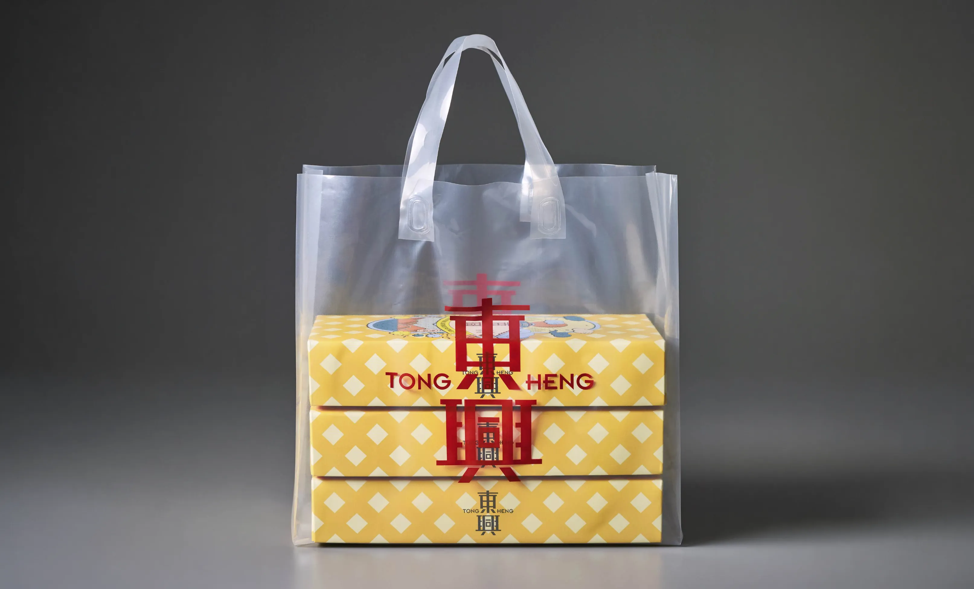
“Joy in a Bite” became the brand essence. It gave every decision a simple test: if it did not bring delight, it went back to the drawing board. The identity draws attention to 一口, or “a bite”, within the Chinese character 興, bringing the idea into the brandmark itself.

“Joy in a Bite” became the brand essence. It gave every decision a simple test: if it did not bring delight, it went back to the drawing board. The identity draws attention to 一口, or “a bite”, within the Chinese character 興, bringing the idea into the brandmark itself.

The same spirit shaped the food styling, packaging and store. 1960s-inspired terrazzo, a clan-hall mirror, diamond-shaped lights and floor tiles, and an L-shaped display shelf gave the bakery a brighter, more contemporary presence while staying familiar.

Beneath the visual delight of 60’s-inspired terrazzo countertops and clan-hall style full-length mirror is a deeply considered approach to realising the brand essence in spatial form. By designing the desired user journey experience for customers and staff, we arrived at elegant solutions that worked holistically for the brand.

Things like a modern, Instagrammable approach to product display; subtle visual cues like the diamond-shaped lighting fixtures and floor tiles; and an L-shaped shelf layout that extended to the sidewalk that engaged passersby, and allowed for sales to continue even during closed-door events.

The new branding is also translated to the store’s exterior, from the main signage and awning, to the custom lighted signage that beacons to visitors exploring the environs of Singapore’s Chinatown.

To bring the brand story into the digital realm, a content strategy was developed for Tong Heng, consisting of 4 pillars: Inspire, Inform, Promote and Engage. Posts were designed to communicate Tong Heng’s joyful personality to generate organic engagement and follower growth with younger consumers.

The brand moved forward without losing the warmth that made it loved in the first place.